I am taking the plunge--changing my website provider to
FASO. I do hope this is not toooo painful a process. They are supposed to move my domain name, so it should remain the same. Here's hoping!
I have spent all afternoon working on the new site, and I am just getting started! I have only uploaded a dozen images, putting them into collections. Once I get going, adding images will be simple. But change is painful!!
I've been doing a lot of study about color lately. Two students came to my studio a couple of weeks ago to explore the nuances of using color in our art. What a blast we had!
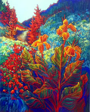
The image on the left, "Spots of Sun," is intended to explore the split complements of Y, BV, RV. It's my first pastel in a while.
My Weekly Color Challenge #1 for my students (and for any who would like to participate) is this:
- Using a standard primary palette, choose a complement pair (ie R-G, B-O, Y-V, YO-BV, RO-VG, RV-YG). If you want to keep it simpler for the first time, choose a primary pair.
- Paint two studies--1@ warm dominance and cool dominance.
- Do a small painting using the combination.
Points to consider:
- What is the dominant temperature?
- How much contrast or depth comes from putting warm against cool?
- How do you achieve rhythm and/or a center of interest?
- How much pure color can you use of each of the pair and still achieve harmony?
Send me pictures of the results by next Thursday. Let's play!
I would enjoy having an ongoing exchange of ideas and experiments with any interested artists.


 Posts
Posts